 If you’re designing health infographics for the general public then graph literacy is an important topic that we’re only just starting to understand. The bulk of academic research on infographic and graph consumption has used students as its user base. That doesn’t help the designer or commissioner to understand the wider implications of using graphs with a diverse set of people. Galesic & Garcia-Retamero’s work helps here.
REF:::::::::::::::::::::::::::::::::::
Galesic, M., & Garcia-Retamero, R. (2010). Graph Literacy A Cross-Cultural Comparison. Medical Decision Making, 31(3), 444-457
:::::::::::::::::::::::::::::::::::::::::
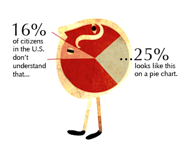
In their study that ‘tested’ U.S. and Germany citizens (almost 500 people in each country) it was found that 16% of Americans and 12% of Germans did not know what a quarter of a pie chart represented as a percentage. So more than one in ten cannot understand this type of chart correctly as a numerical proportion. Does this mean that they don’t understand 25% as a concept or that they couldn’t read the graph correctly? – e.g. identify a quarter shape as a value. In addition, the study suggested that those people with low numeracy skills were particularly poor in graph literacy. Whilst not a surprising finding, it does give us more of a case for testing our work more widely.
