The King’s Fund in the UK do some brilliant work. The King’s Fund is an independent charity working to improve health and health care in England and its website contains an array of accessible material, drawn upon by a massive audience of Public Health professionals. It is important though to look critically at potential comprehension problems these graphics alone might have without their accompanying text. This recent set of slides are a case in point. Whilst their infographics are consistently presented using analogous colour schemes and have high appeal factor when we analyse them as pieces of visual communication they fall short of clearly representing the data.

What works in this icon array is a sense of diversity (and it’s helpful to think about audiences like this I think!) however it doesn’t help us extract the data without very, very close inspection. The accompanying text tells us that 2 in 10 adults are smokers, that 7 out of 10 men and 6 out of 10 women are overweight, a third of people have drinking habits that could be harmful and half of men and a third of women do not get enough exercise. This is a hugely ambitious icon array that attempts to combine all 4 key public health concerns into one graphic – no wonder it doesn’t work despite the well drawn and compelling presentation! In Stephen Few’s book, ‘Show me the Numbers‘ from 2012, one of his ‘rogue gallery’ formats is the ‘Unit Chart‘ which demands counting – here we have the same problem and it becomes a game of spot the difference. By combining the issues too we end up with some icons that both smoke and are overweight – the frequency of this e.g. how many folk do both, isn’t in the data so this is telling us more and possibly misleading information than is in the text. At best this works best as an illustration rather than an infographic.
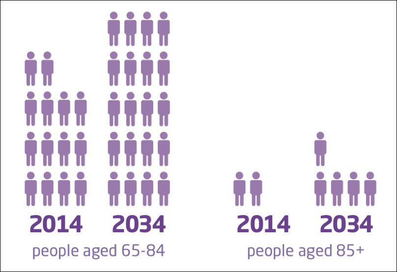 There is also a problem with the bar chart/icon array (to the right). It’s unclear why the icons are in units of 4 (5 would be easier to count). The accompanying text tells us that ‘over the next 20 years in England, the number of people aged 65-84 will increase by over a third and the number aged over 85 will more than double’. It’s probably best to use consistent phrases in the text e.g. ‘over a third and more than double’ could confuse. What do you think?
It’s sometimes easy to spot mistakes in infographic design but hopefully it will happen less frequently as we see more robust testing taking place – just a quick show of hands in the office is better than us designers keeping it to ourselves. Let’s keep infographics as elegant as these but let’s focus also on that precious story they contain.
