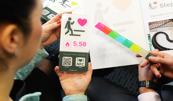
 There are some excellent examples of infographics being developed to encourage occupants of buildings to take the stairs instead of the lift. The example to the left is taken from https://www.stepjockey.com, a company who specialise in using infographics in buildings, together with tracking apps, to get more people to use the stairs. It’s a compelling idea and the evidence base for their claims seems strong though it’s unclear how habits changed during the 4 week period of testing. The infographics featured on the signage are clean and bright with clear focal points and serial, gridded structures that makes the signs easy to follow. The greatest impact of the intervention was on women who were overweight which leads us to wonder how to encourage the men too to act on the message. A longitudinal study would also help understand the long term impact and whether indeed, new habits were formed, as were claimed in the questionnaire results.
A simple google-image search of ‘take the stairs’ reveals a very mixed bag in terms of quality. The focus of many of them is the burning calories message, the most successful message of those trialed by StepJockey.
 This, for instance, is an example from Energy Star that encourages the use of motivational signs. The tone of voice is commanding though the graphics style is old-fashioned and friendly. There currently doesn’t appear to be any studies about the influence of tone or style on behaviour and it may be an area to look into. There are many examples of ‘home made’ signs and it would be interesting to know whether these were taken as seriously as more corporate styles. In terms of quantity of calories, there are many different ways of framing this value (e.g. more accumulatively) and again, it would be interesting to know whether different quantities alters impact.
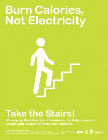 The Centre for Active Design also produce free signs to display what they call ‘point-of-decision prompts’. 30,000 signs have been distributed at the time of their webpage update. This shows there is a real demand for good signage. They don’t employ data-led infographics but simple messages seem to be enough. The bright background of this particular image should be dominant against most backgrounds without the ‘alarming’ red used by many of the Stepjockey signs.
If you know of any buildings where staircases are well hidden then it might just be worth investing in signage…
