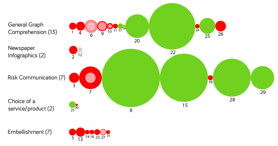
 Can we take advantage of the power of infographics to highlight issues with our research methods? Here’s an update to the ‘Evidence Base‘ page today that includes an infographic of sample sizes (samples range from 5 to 3536) and sample types (students or the general public) taken from 31 academic papers published from 1985 to 2014. This is very much a work in progress and the graphic will expand over time so please check back.
Visualising health: Infographics in Public Health
AHRC Funded Guidance on Infographic Design in Public Health – University of Leeds
