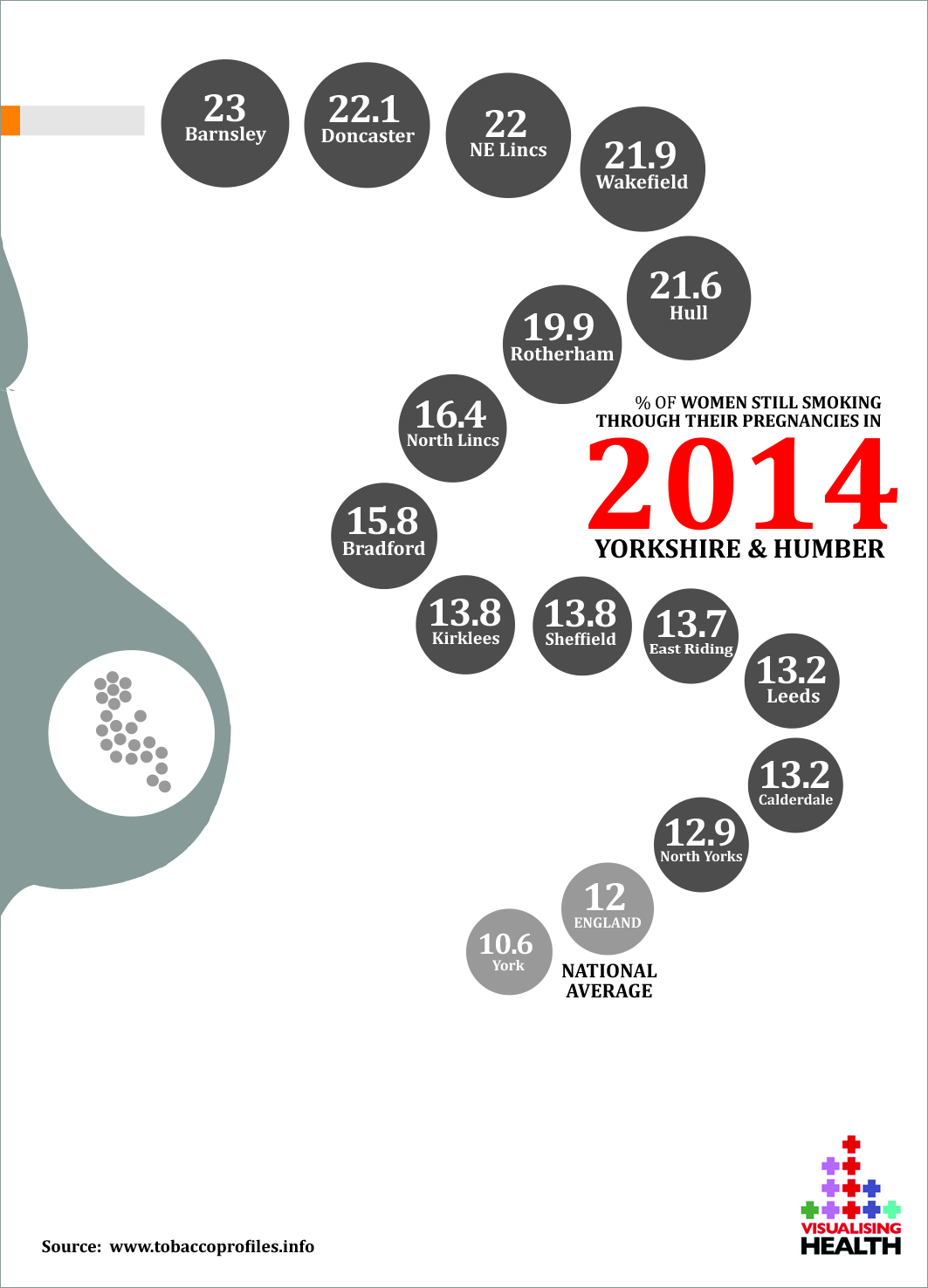
Public Health datasets are very rich indeed. You only need look at some of the powerful tools available in the UK such as http://www.tobaccoprofiles.info. Here you can view each city/area and view the prevalence of smoking and smoking-related disease found there. At www.tobaccoprofiles.info the presentation of data is, however, not overly compelling, though its colour coded tables are very legible and transparent for those in local authorities to extract data from. It strikes me though that these are true stories worth sharing outside local authorities and by presenting the data differently (shown above) there are ways of highlighting key messages and getting people in local areas talking.
One of the findings of the testing with the general public in West Yorkshire (we spoke to people in Leeds, Halifax and Wakefield in February 2015) was that they generally appreciated a visual element that reflected the subject of the data presented. This only needed to be quite subtle, particularly when the subject matter could be potentially very negative. In the example above the visual cue is sensitively done using broad shapes to suggest pregnancy and smoking. The colour red used here acts as a warning that there is something that needs our attention.
The people we spoke to also generally appreciated ‘something different’ that didn’t look like a graph or have too many visual elements in it that needed working out. In the example above the visual design has been influenced by the flowing designs of David McCandless. There are, of course, some sacrifices to be made when moving away from more standard formats such as bar graphs. One sacrifice here is complete accuracy in the placement of the elements (in this example, vertical distance is not mathematically indicative of performance). However, absolute values are very clearly displayed, so the viewer can see, for instance that Leeds and Calderdale share the same values even though one is above the other. Where do aesthetics give way to mathematical accuracy when designing for the public? It’s still a grey area. What is of absolute importance is that the key story, that Yorkshire and the Humber is performing poorly nationally, comes across as part of a journey through the visualisation. The end of the ‘smoke’ in this image reveals the story, helped by an annotation layer than picks out ‘the national average’.
What also came across very clearly in the public testing was that people recall and pay attention to data that affects them directly. The first link in this chain of engagement is to make the data more reader-friendly so the viewer gives the data story a chance. The local nature of this compelling data should help make the story relevant.
Local public health data belongs to the public in those local areas. In the case above, Barnsley people need to know there’s a problem, with 1 in 4 women still smoking when pregnant. We need to find better ways to engage people with the data – extracting data from http://www.tobaccoprofiles.info and experimenting with its form is just the start…
