Public Health data is usually concerned with population-level data. This data is usually visualised via a ‘neutral’ objective tone. For instance, icon arrays used for showing proportions consist of identical circles or icons of various consistent shapes. The idea of neutrality in design is problematic – see Robin Kinross’ 1984 article ‘The Rhetoric of Neutrality‘ – and as designers we should be on the look out to challenge the norm and question how infographics communicate on more subliminal levels.
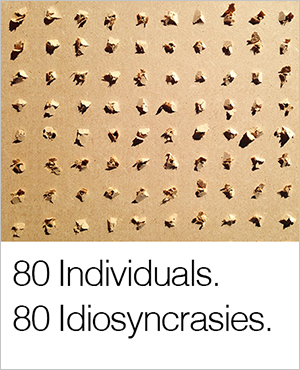
Visualising the health of a population is particularly challenging as it’s constantly shifting. A statistic at any given moment is out-of-date the next and can only ever be based on approximations. It may well be time to acknowledge this within the visual language that we choose to use. Using less precise visual languages, found in unpredictable materials may, in some sense be more precise as a whole. 80 holes drilled in a board result in the same holes on one side but a different ‘story’ on the other, randomly dictated by the reaction of the material. Whilst 80 people may have the same condition they are not the same people and may be dealing with the condition in 80 different ways. What room is there for capturing what I term here ‘more precise imprecision’? I raise this as a question here for us all to consider though there are several interesting places to look for precedents, particularly regarding visualising uncertainty of the future…
Recommended reading:
Speigelhalter’s at al paper from Science, 2011
Andy Kirk’s excellent blog entry on uncertainty.
